The Bad-Debt Black Box: Auditing Savii’s Recovery Module
A Savii Philippines case study
I joined Savii mid-project, and there was already four years of history behind it. Onboarding was the usual drill: watch the old videos, meet the team, try to get up to speed.
Then I came across a video called “Everything That We Know About Recovery So Far.” It ran about forty minutes, and what stayed with me was how much of it was still open.
The problem
Savii gives out loans based on salary deductions in the upcoming months
The loan amount gets deducted from your paycheck directly, so it’s guaranteed through your job. As long as you’re employed, it’s perfectly fine because your money is getting deducted.
The moment someone loses their job, the whole concept breaks down, because no salary means no deduction, which means no repayment for Savii. That’s what recovery is, and it turned out to be one of the biggest sources of bad debt in the entire product.

When I started asking around the old design team, and even our POC for the product, everyone had a piece of it — the whole picture had just never been written down in one place. That’s when I decided to just figure it out myself.
Digging in
There was no Figma file for this flow, no documentation, nothing to point to
Just scattered pieces here and there.
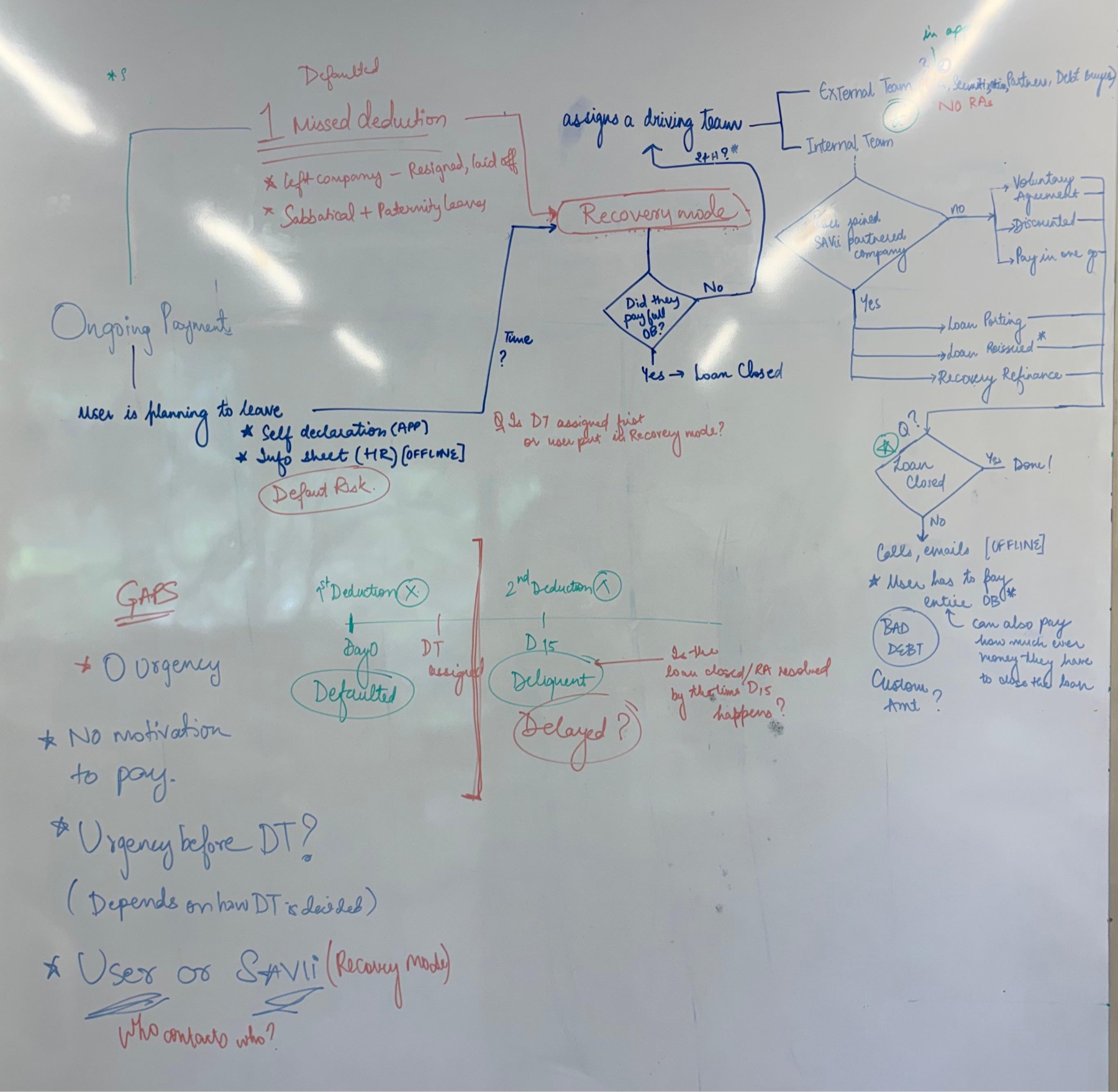
I found the one former designer still at the firm who’d worked closest to this, and we sat down for a two-hour whiteboarding session. We put down everything we each knew and tried to make sense of it together. What we ended up with wasn’t clean or final. It was our best attempt at putting the whole process down in one place for the first time.
The green light
The stakeholders already agreed recovery was costing them money
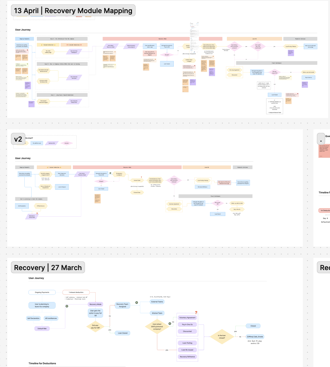
What they weren’t sure of was whether fixing it was worth the hours. So I took the whiteboard version, cleaned it up in Figma, and got the recovery team in a room to walk through it with me.
I went in expecting to learn from them. What actually happened was that we started filling in each other’s gaps.
“Let me check with the team on that.”
“I’ll get back to you on that step.”
That kept happening, again and again — the next detail always lived with someone on another team.
That meeting ended up being the proof of concept. Not a prototype, just a room where everyone could finally see the whole shape of it at once. That’s what got me the green light to keep going.
Getting to a version everyone agreed on took three sessions in all — one internal, two with the client — and people from well outside the app team: the recovery team, and the leads of separate divisions who each owned a piece of the process. There was enough ambiguity that every pass turned up another branch or another exception, so the map got redrawn between each one.
That back and forth is exactly why this was worth doing. Pulling it into one place is what turned recovery from knowledge scattered across teams into a module everyone could finally see clearly.
The real insight
The biggest discovery wasn’t a UI bug
Once I had buy-in, I sat down properly with the app team and the recovery team to map the whole thing out. And the biggest discovery wasn’t a UI bug. It was this:
-
1
Users genuinely had no idea what “recovery” even meant. Technically, recovery mode kicked in after two missed deductions, but users had no way of knowing the first one had even been missed. So by the time the second one hit, it landed as a shock, and they were suddenly inside a process nobody had explained to them.
-
2
There was no sense of time inside recovery itself. Day one and day fifty-one looked exactly the same, just one static red banner. No progression, no growing urgency, nothing telling the user things were escalating or that a window was closing. It felt less like a process and more like a warning label that never went away.
-
3
The tone put the blame in the wrong place. Underneath all of it, people who’d lost their jobs through no fault of their own were being made to feel like they’d personally failed to pay.
That’s when I landed on the one rule I used for every fix after this:
The rule
Don’t blame the user. Help them exit the situation.
What I shipped
The first two things I got out the door
From there, I listed out every pain point I’d found, sorted them by impact versus effort, and started folding fixes into weekly sprints alongside the regular feature work already going on.
A direct, informed entry into recovery
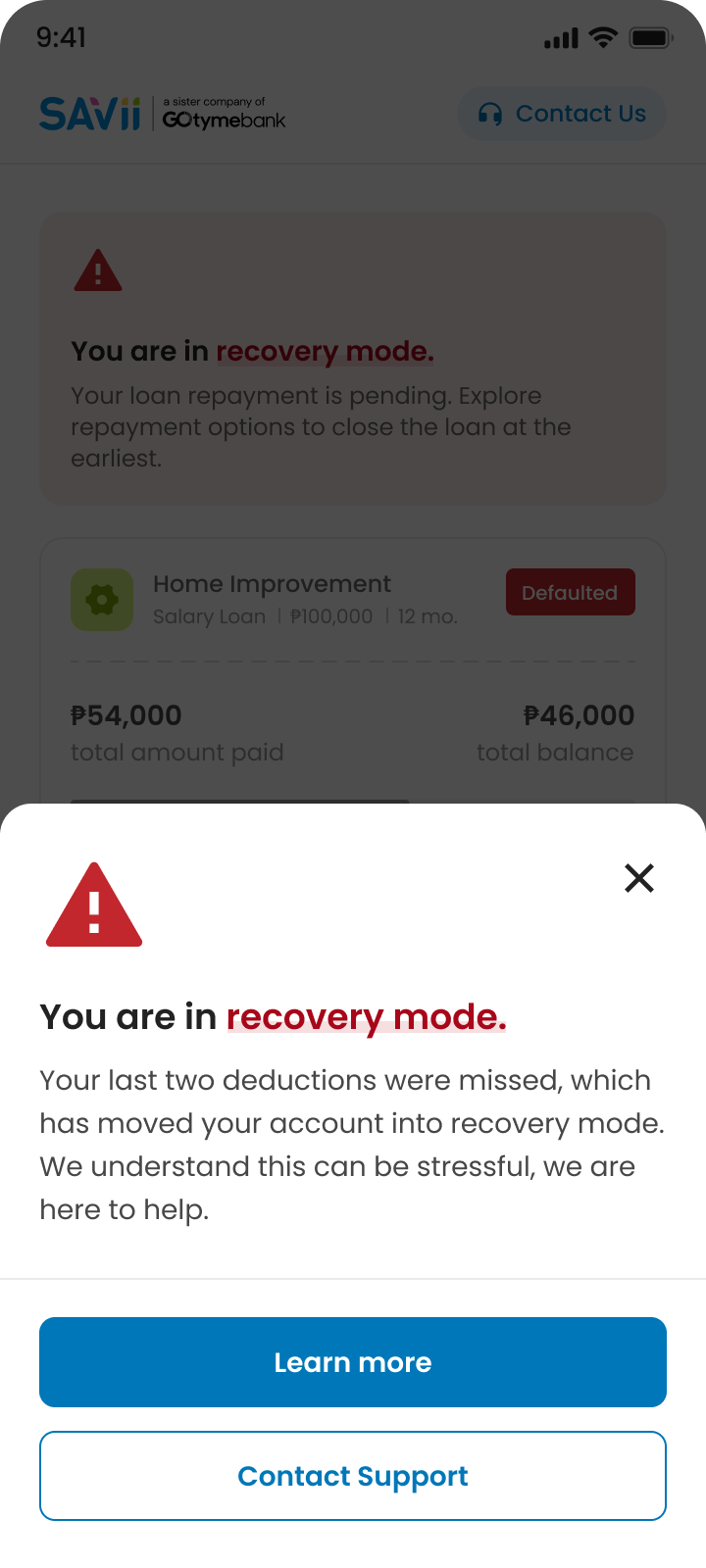
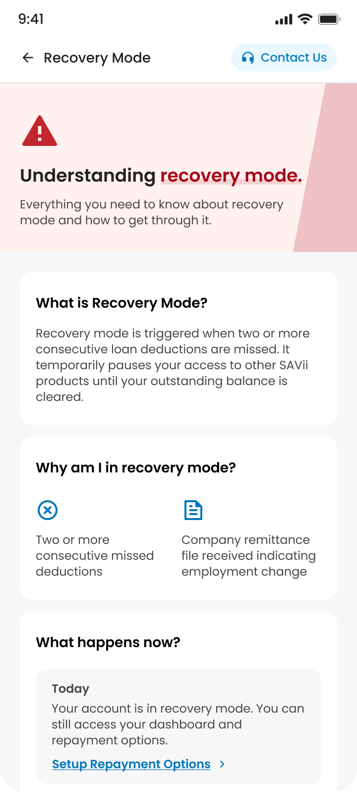
Before this, there was barely anything to go on. No real notification, just a line saying the loan had been paused — which is misleading, because it says nothing about what actually happened or what comes next. Users landed inside recovery with no idea they were in it, or why.
Now the entry is explicit: what recovery mode is, why they’re in it, and what they can do from here, with visible support options. The experience stops feeling like an accusation and starts feeling like a way out.
The missed-deduction alert
Nothing told the user that a single deduction had been missed. Recovery only kicked in after two — and depending on the team, several other factors could trigger it too. Now the first miss gets its own screen: what happened, and how to get out of it, whether that’s contacting support or checking with their people. It can be paid off manually, long before the recovery threshold is anywhere close.
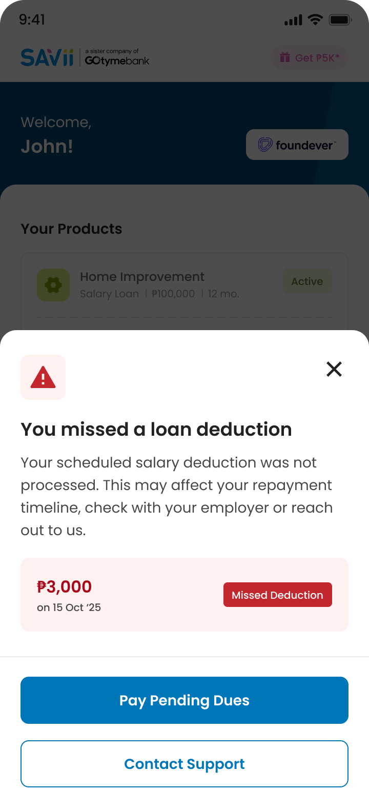
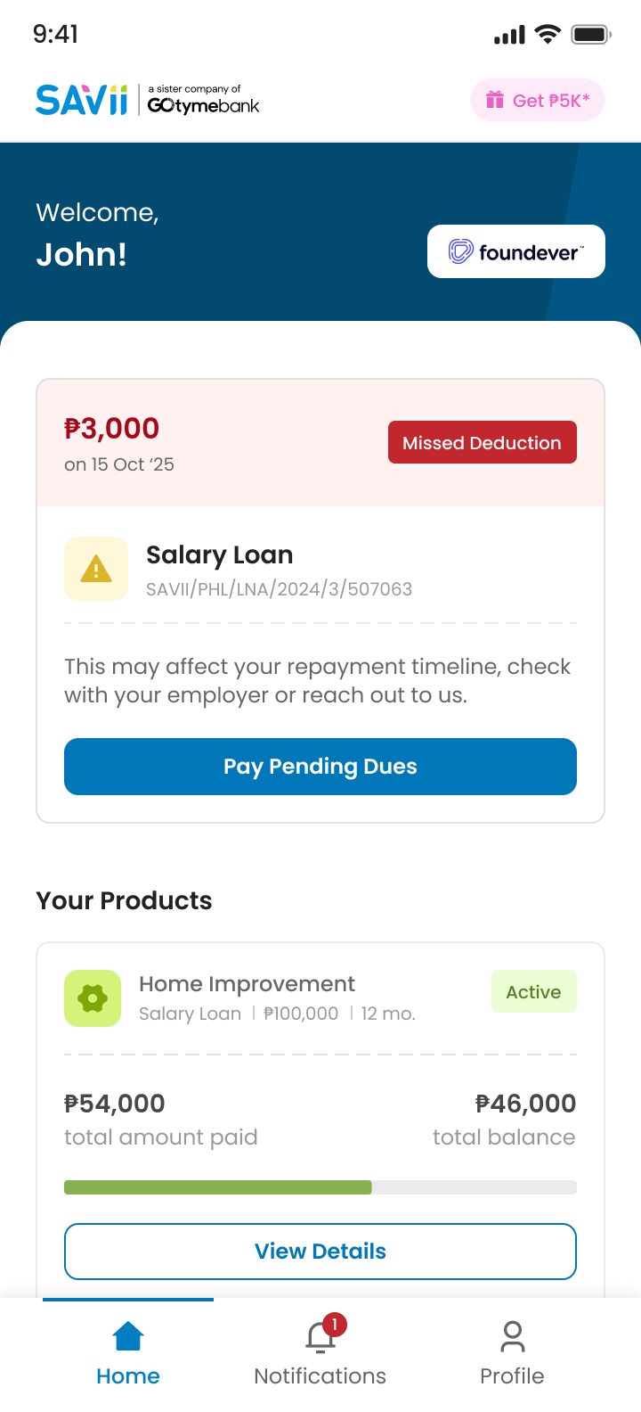
Neither of these are big, flashy changes. But they directly undo the pattern where the app was quietly blaming people until they gave up and disappeared.
What ships next
A prioritized roadmap, handed to the team
Not everything fit the sprint slots I had. Every pain point I’d found got written up with possible solutions against it, then sorted two ways.
First by severity — P0 for critical, then P1 and P2. Then by impact against effort, which is what separates the quick wins, low effort for high impact, from the ones that cost a lot and move very little. What’s left behind is an ordered list the team can work straight through rather than a pile of loose observations.
Top of it is the flat, unchanging feeling of the recovery state, where day one and day fifty-one looked identical. It needs some way to show progression or urgency, some signal to the user about where they actually stand instead of one static red flag — a fix that needs more design and engineering time than a single sprint slot gives you.
The write-up handed to the team — each pain point banded P0 to P2, with possible solutions listed against it.
Recovery is a process, but the product still renders it as a single state. Until someone can see where they are inside it — what has changed, what’s coming, how much room is left — the screen stays a warning label instead of a way through.
The hard part
There was no big stakeholder fight in this one
The real challenge was more personal: protecting time for something nobody officially assigned me, while making sure my actual sprint work didn’t slip. That balance was on me to manage, week after week.
Where it stands
It’s still early. Too early to point at a clean before-and-after number
But a process that went four years without ever being written down now has an actual map, a shared understanding across teams, and a principle that’ll outlast my time on this project: don’t blame the user, help them get out.